 University of North Texas
Step 2. Creating and Editing in Modern Campus
Are you interested in...
Creating and editing Pages, Sections or Folders? OR Inserting links, Images or Videos?
STEP ONE
To create a new page, folder, or site section, navigate to that particular folder in the Pages List View. The URL for the page will be generated by including the folder structure to the end of the domain.
For example, a page in the “story” folder on the main UNT site will have the URL unt.edu/story/filename.html.
 |
 |
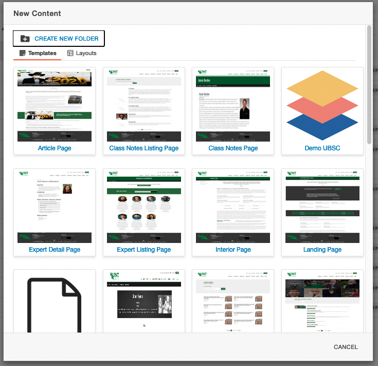
New Content Modal Box (Left)
In the desired folder, use the blue + NEW button to choose the new content to create.
If the button is clicked it will open the New Content Modal box.
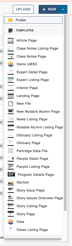
New Content Dropdown (Right)
Selecting the down arrow will open this New Content Dropdown. You can use either method
to add your new content to the desired folder.
STEP TWO
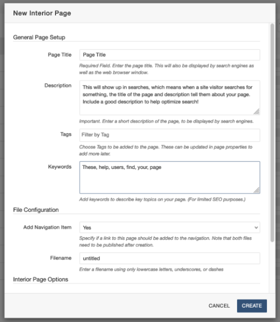
New Interior Page Example
- Choose the template or layout for the content. For most webpages “Interior Page” is a good and versatile choice.
- Click the title or thumbnail of the template for the new content details form (right) to open.
- In the form, enter in the page title, short description, keywords and filename as guided.
- Description and keywords are important to optimize for search so be sure to include them.
- The title and the file name do not need to be the same. The filename must follow the Modern Campus CMS filename standards, whereas the title can include upper- and lowercase letters, spaces, numbers and most characters. The title is visible to users, so it is important to have a descriptive one.
- Once all applicable fields have been filled out, click the CREATE button to make the new page. Modern Campus will create the page and then open it in the editor view.
STEP THREE
Edit The Page Using This Toolbar.
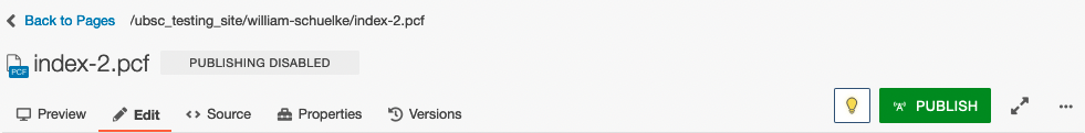
Left
Preview
You can preview your page. Remember that from Staging and Production, the pages could change.
Left
Edit
This is where you can edit your pages.
Left
Source
Not everyone will have this section.
Left
Properties
More properties will be available when you have the page checked out.
Left
Versions
You can go back and edit different versions of the page.
Right
Lightbulb
This is where you can click to check in and out content.
Right
Publish
Right
Focus Mode Arrows
Focus Mode will toggle between the default view and a minimized toolbar view that
takes up less vertical space on the page.
Right
Elipsis
The More Actions Ellipsis is used in many places throughout the Modern Campus interface,
and the actions available will vary based on context and your permission level.
STEP FOUR
Editable Regions
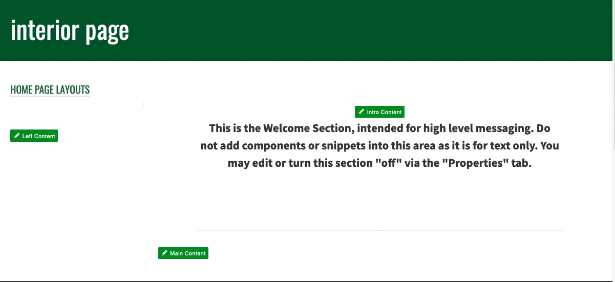 When in Edit Mode, choose the specific region to edit on the page. Each page type
has different editable regions. Some regions require enabling or disabling, while
certain page types have a multi-edit form instead. The Interior Page template is highly
versatile and suitable for various purposes, and can be built out for almost every
need.
When in Edit Mode, choose the specific region to edit on the page. Each page type
has different editable regions. Some regions require enabling or disabling, while
certain page types have a multi-edit form instead. The Interior Page template is highly
versatile and suitable for various purposes, and can be built out for almost every
need.
The label of each editable region is a green button that serves as an access point.
Clicking a green button opens the corresponding editable region. To switch between
editable regions, save the page to exit the edit content view. Use the preview button
in the Page Action Toolbar to discard changes. Please note that unsaved changes cannot
be recovered.
The WYSIWYG Editor allows you to type, edit text, and insert various content such as images and links in the selected region. It provides a live preview of how the changes will appear on the published page, ensuring a "What You See Is What You Get" editing experience.
Editing an Existing Page
Checking Out Content
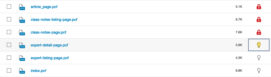
Checking out a page in Modern Campus locks access to one user so that no one else can make changes while it’s being edited.
To check out a page, simply click the lightbulb icon for the page, turning it yellow. When other users view the page, there will be a red lock icon in the place of the lightbulb. This means the page is locked for editing. Only higher permission level users can break this lock.
STEP ONE
To create a new page, folder, or site section, first navigate to that particular folder in the Pages List View. Remember that the URL for the page will be generated by appending the folder structure to the end of the domain. To create a new folder, hit the "create new folder" section.
STEP TWO
Fill out the name of the folder and hit "create".
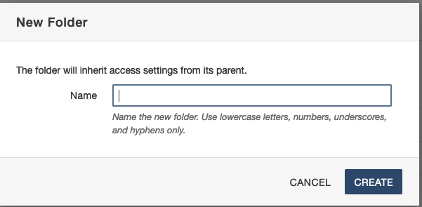
*NOTE: Folders should only be created to hold files such as PDFs and Images. Not as another site section. Keep reading to make a site section.
STEP ONE
To create a new page, folder, or site section, first navigate to that particular folder in the Pages List View. Remember that the URL for the page will be generated by appending the folder structure to the end of the domain. The process to create folders and sections is similar. Both will create a new folder in the current folder, but a section will also create the following the files needed for each site section: _nav.ounav, _props.pcf, and the index.pcf.
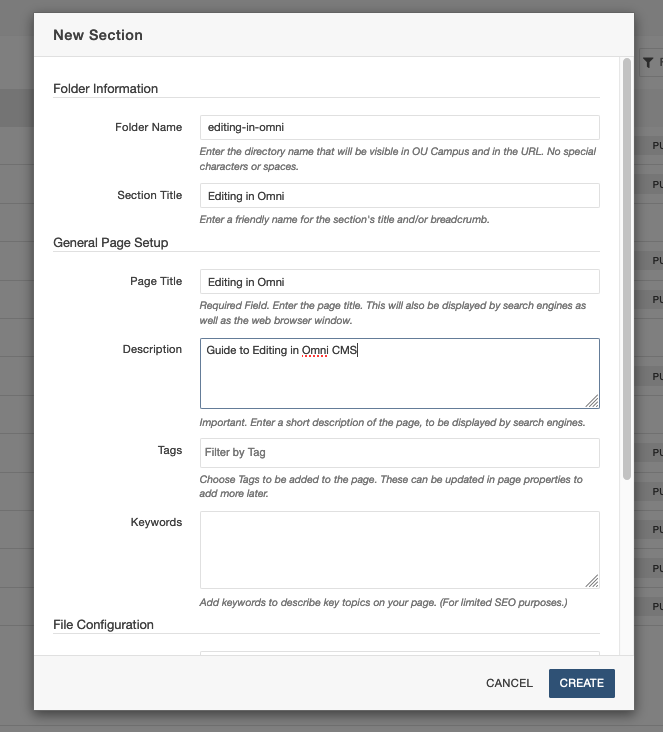
STEP TWO
The New Section modal box (right) will guide you through the process of making a new section. The folder name must also follow the Modern Campus file naming standards (no capital letters, no spaces, etc.). Once the new section has been created, Modern Campus will open index.pcf in edit mode for the user.
STEP THREE
The new section will also create the following files within the new folder:
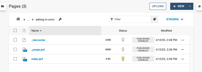
_nav.ounav
This file is used for setting up left sidebar navigation on pages within the folder.
_props.pcf
This file is used to populate breadcrumbs. If it is deleted or if “$skip” is entered
into the source of the props file, the current folder will not show in breadcrumbs.
index.pcf
This functions as the home page (or landing page) for the folder. When external users
click the folder’s name in the breadcrumbs, the index page will load.
In Modern Campus, links are commonly added using the WYSIWYG Toolbar. Modern Campus offers an additional feature called Dependency Tags, a powerful resource to web content editors. Dependency Tags enable linking to content without relying on relative paths. This means that even if the URL changes or the file is moved to a different folder, the linked page or image won't break. It's important to note that Dependency Tags can only be used to link content within an Modern Campus site. It is recommended to use dependency tags whenever possible
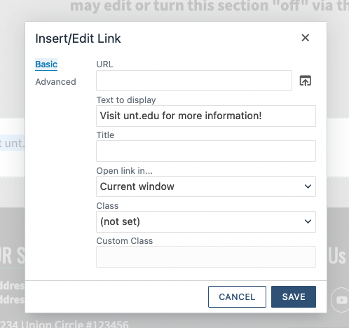 |
To insert a link on a page:
|
|
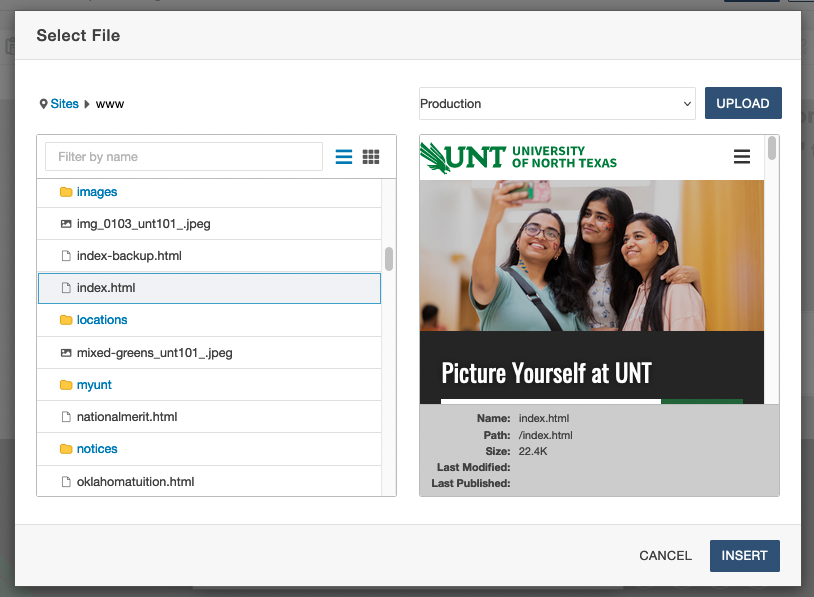 |
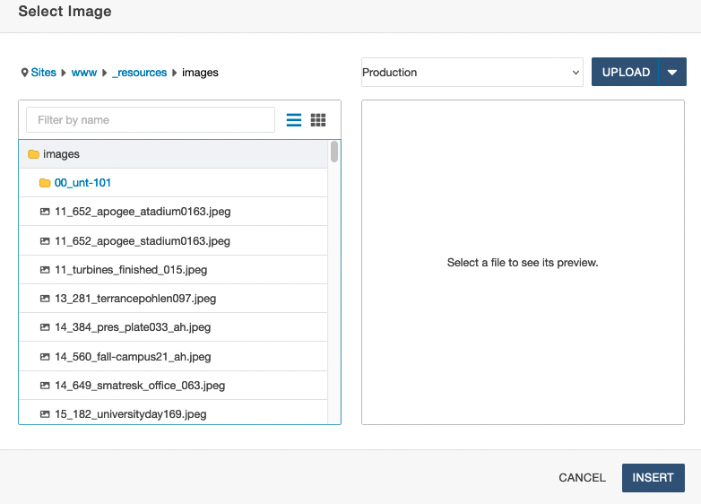
The above image shows the last step before inserting a link as a dependency tag. The preview window is useful for verifying the content being chosen before you click the INSERT button. The target can be selected in either the Production or Staging environment. If a file is chosen in staging, Modern Campus will verify the production target for the link.
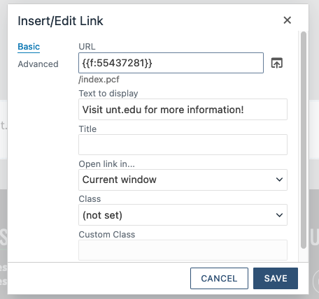 |
Notice what appears in the URL field - this is a dependency tag. Modern Campus CMS uses something called Dependency Manager to keep track of, and link to, internal files. Each file is assigned a unique tag that can be inserted as a link. This way, the link remains valid even when the file is moved or renamed (but will break if a file is deleted). Other fields include:
Finally, click SAVE to place your link on the page. |
To edit an existing link, place the cursor in it and then select the Insert/Edit Link icon from the toolbar. The Remove Link button is also available next to it. The edit link menu can also be accessed by selecting the link text and right-clicking on it.
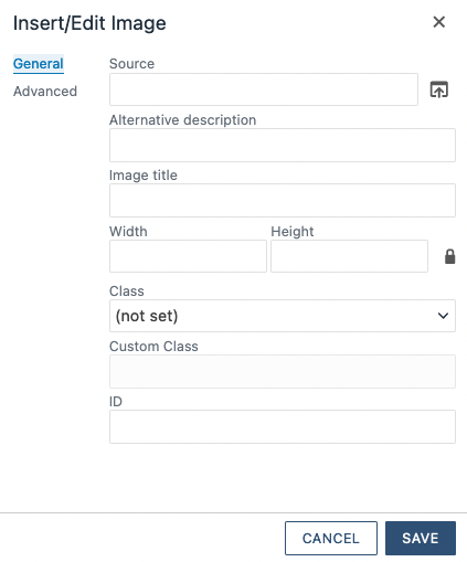
Images can be inserted into most WYSIWYG sections, as well as inside of components. The method to insert an image in either scenario is generally the same. The only major difference between inserting an image in a page and adding one to a component is how the process is initialized; in a component the image insertion will be part of the component creation form.
To place an image on a page:
|
 |
 |
|
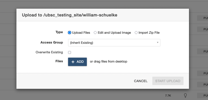
Images can also be uploaded to a folder on the site database. In order to upload an image:
- Navigate to the desired upload location (folder).
- Select UPLOAD from the top toolbar, on the side of the + NEW content button.
3. Using the upload dialogue box, choose the + ADD button to open a file browser and select the
image to upload.
 4. After adding the image file, it may need to be renamed to comply with the file
naming standards (no capital letters, no spacing, etc.).
4. After adding the image file, it may need to be renamed to comply with the file
naming standards (no capital letters, no spacing, etc.).
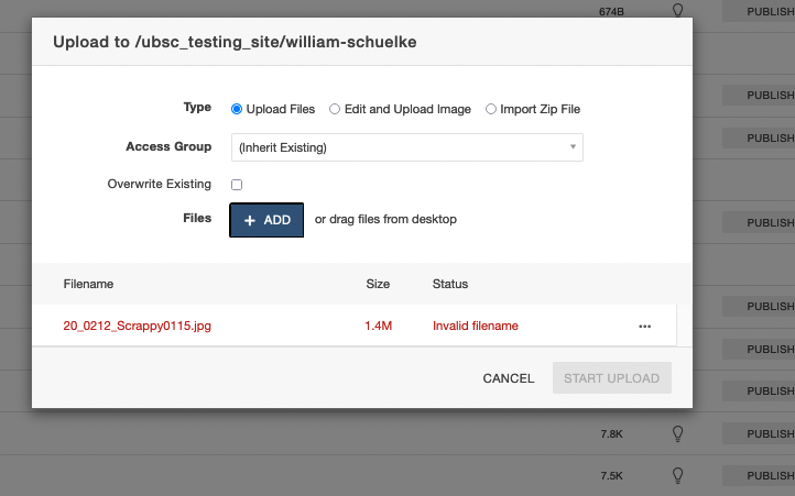 5. Click the More Actions Ellipsis and choose Rename, then correct the name so there
are no spaces and no capital letters. The only permitted characters are: lowercase
letters, numbers, and the (-) and (_) symbols.
5. Click the More Actions Ellipsis and choose Rename, then correct the name so there
are no spaces and no capital letters. The only permitted characters are: lowercase
letters, numbers, and the (-) and (_) symbols.
6. Once the name is fixed, it will still show as red (see image below). Click anywhere inside the dialogue box (ex. in the white space) to finalize renaming it.
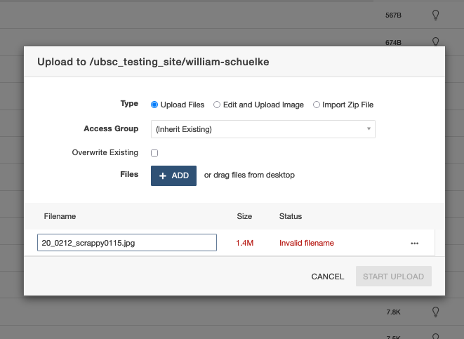 7. After this, the START UPLOAD button will no longer be grayed out and the file can be uploaded.
8. Publish the image by checking the box to the right of it in the Pages List View,
and then using the toolbar at the top to publish it.
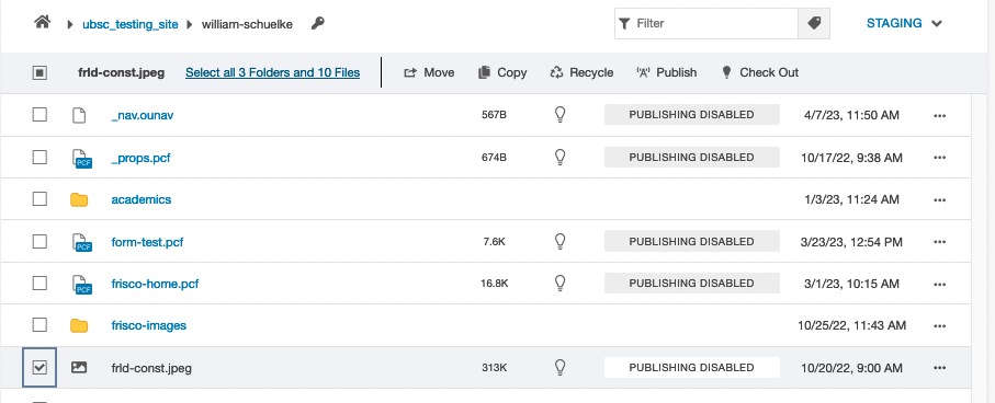 Unpublished images are not visible on published pages!
To place a video on a page:
- In an open editable region, place your cursor on the page where you want the video to be.
- In the toolbar, click the Insert/Edit Video button (section 3.6, #5 on the WYSIWYG Toolbar Map).
- To insert a video that has been uploaded to Modern Campus CMS, select the file chooser
icon in the Source field and browse for the video.
Below the Source field, users can specify the video’s width and height. - Once you have found the video file, click Insert.
- To embed a video from an external source (such as YouTube), paste the video URL in the Source field, or paste the generated embed code in the Embed tab.
- In the Advanced Tab:
- Alternative source is where users can enter a backup file in case the video doesn’t display properly.
- Media Poster is where you can upload a thumbnail.
- Click OK to place the video on the page. While in edit mode, you’ll only see the video as a gray box; save and exit the editable region to see how it will display on the published page.